
Now that Dutch and I are nearly landed gentry and have enough disposable income to go soak up the high culture of the various museums we joined last month when we were feeling flush I can sit back and ponder things a little.
Like the mystical combination of orange and blue, for instance.
Orange and blue.
Blue and orange.
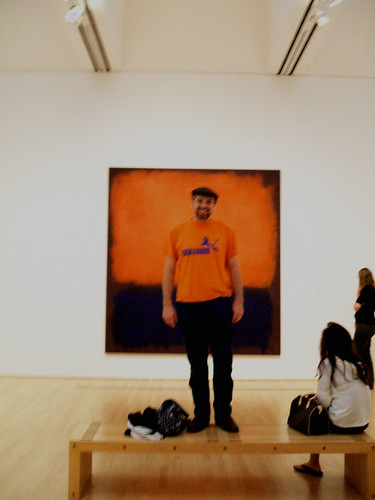
Dutch and I were wandering around the SFMOMA and we found this painting by Rothko. I looked at him, and then I looked at the painting. Was the painting as right at an orange tee shirt with blue jeans? Or was the combination Dutch chose as right as a Rothko?
I saw this particular painting for the first time about five years ago. I had come up with a group of art teachers for a professional development day (one of the huge perks of being an art teacher is that PD days generally involve spending lots of time in a museum). Up until then I hadn't been much of a fan of abstract expressionism. I had seen the famous Pollocks and Rothkos reproduced in books and hadn't been moved by them at all. When I finally saw them in person, I was blown away. Especially by this particular painting. If you stand three feet away and let your eyeballs focus a little beyond the surface of the painting, all of a sudden, you are transported to another world, of a limitless orange sky and a silky blue sea. My memory is so saturated that I associate an orange-laden breeze coming off of it.
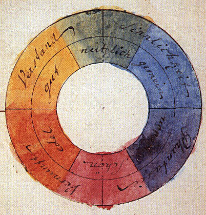
Rothko did not invent the combination of orange and blue. The two colors are on the opposite sides of the color wheel. I found Goethe's example here. I have gone over this with hundreds of students. This combination is called "complementary" and when juxtaposed, they vibrate. Or, in my mother's words, they clash. Maxfield Parrish is another painter who exploits this to wonderful ends. Pictured here is "Cadmus Sowing the Dragon's Teeth."
Orange and blue is one of my favorite complementary pairs. They are opposites of color temperature as well. The orange is hot and the blue is cold. No other combination evokes the "golden hour" sunset light so magically.


This is a picture I took a few years ago with a medium format plastic camera of an actual tree at sunset. Orange and blue is dramatic. The more I think about it, the more I want to start painting again.


5 comments:
I just love this post and all your examples. I have a color chart someone made which correlates colors with birthdates, Gemini being orange and Sagittarius being blue. It all reminds me of the Von Suppe Fine Arts Camp and how nobody could mix a satisfactory green from the primary colors they were given.
It wasn't until I was in college taking a color class that I found out why we had such a hard time at VSFAC mising colors. If you use the "process colors" ie, the colors printers use, cyan, magenta, yellow and black, then you get fantastic oranges, purples and greens, but figuring out how to get a decent lipstick red is nearly impossible. It reminds me of the problems with tempered tuning... do you go for a good third and sacrifice the fifth or vice versa?
that photo looks just like max parrish! hey are you at the APE this year?
Dan, I won't be tabling at APE this year. I want to go as a visitor.
I just saw a BBC story about the Rothko exhibit which opens this week in the Tate Modern in London. They interviewed his son, who said pretty much what you said about the paintings!
Post a Comment