Showing posts with label arts ramblings. Show all posts

Tuesday, October 21, 2008

This is not a politics blog...


los boletas oficiales

For good reason, I am a wretched Citizen. I often make my decisions at the polling place based on the sound of people's names (last year, I only voted for female school board members). My absentee ballot arrived today with not one, but FOUR rainbow colored ballots. The guilt just washes over me as I think of the people who have fought and died so I could cast my measly votes. Then my cynic steps in and says it doesn't matter because who ever gets elected will get bought off regardless. Then my really super cynic starts kicking me in the shins because now that I registered, I'll probably get called up for jury duty (does anyone actually like jury duty?). The word on the street is that all registered voters get called at least once a year in this town. Dutch has lots of opinions, and I know if I am lazy, I'll just adopt his wholecloth. The thing is, I do care about certain issues an awful lot, but it takes work to sift through all the fuzz and noise to get to the core of the issues.

Things I do have opinions on...

a classic movie poster from Saul Bass


Right now, I am putting together a lesson for the junior high kids about movie poster design. I plan on showing the usual posters from the golden age of design (the 50s and 60s) and I have put together a lot of material for them to look at and read (maybe stuff for another entry) and so now I have design on the brain. And what is even worse, I have been obsessing over how to explain it to 11-13 year olds. Because they are young, I can cheat a little and make simple, illustrated rules that they could theoretically follow without completely understanding (a real issue, considering that I speak English, and most of them speak something else at home). I am struggling with the fun challenge of creating a foolproof schema.


an unbearably beautiful tea label

I was at the grocery store looking for tea and I bought this brick of pu-ehr, and as I was considering which one to buy, it struck me that this tea label is almost unbearably beautiful. One of the things I am considering limiting is the children's palette. We will be using photoshop, so they have potentially millions of colors to chose from. This is a wonderful example of a limited palette (there are only three colors). They also, left to their own devices, tend to cluttered compositions, and random things they find from the web. I will be giving them a list of limitations, and hopefully it will be enough to get their minds going, but not so much that they give up.

::
The tea label is so inspiring because in addition to its limited palette, it has some fine patterns (repeated motifs) and I love the whimsical junk (sailing vessel) included in the seal. The composition is very straightforward, but it works, both in a utilitarian, and an aesthetic way. I don't read Chinese, so the meaning of the characters is completely lost to me, so I can't rate how effective the communication is, but they are always purty (am I betraying my love for exoticism here?). I tore a tiny corner and smelled the tea and looked at it, and I knows pu-ehr when I sees it, and the price couldn't be beat ($3.69) so I bought it. The really gratifying moment came when I was at the Ferry Building today (home of the most overpriced, pretentious, upperclass little specialty groceries in the city) and I found the exact same thing, with an English translation (Yunnan Province Green Pu-Ehr) and an equally English price, $12.50. That works out to $2.00 an English word.

Saturday, September 13, 2008

Intimidation

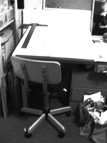
drafting table

Dutch just set up my drafting table. And cleaned it off. Now he is currently sleeping in, so I practically have the house to myself. Not to mention the hours I spent culling, organizing and putting away my supplies in a hopefully rational way, so that when I need them I can find them again.

I am finding this a very difficult situation. After a year of pursuing other things, I have a chance to return to an old love. All my old practices, of carrying around a sketchbook, of writing 'ol Julia Cameron's morning pages, of a religious devotion to life drawing are no longer a part of my daily routines. I don't have a project I am in the middle of. I don't have any deadlines (that is not true, I do have a deadline, but its a biological one).

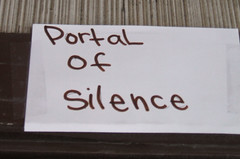
portal of silence

So now I sit at my organized space (relational and physical) and nothing is coming to me. Should I collage? Should I play with photos on the computer? Should I blog? (that is the easy one) Should I try to draw some comics? A submarine? A fat camille?

Part Two

bone box

Shortly after asking myself the above agonizing questions, I tried sitting down at The Drafting Table. I spied an old friend, the Cat Box. The Cat Box has always been a constant muse, inspiring an entire Submarine (now sadly out of print). I love love love bones. So much so, that I am verklimpt right now. I might even love them more than atom crashers. (Did you see those amazing pictures of the new Hadron Super Smasher?)

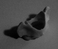
vertebrae

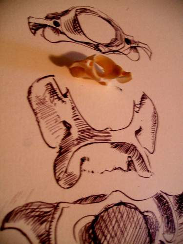
I pulled this little rascal out of the ziplock baggie of small bones. I pulled out a favorite crow quill pen and some Dr Martin's ink.

drawings

Now I am ready to wake up Dutch. (insert devilish snickering)

Thursday, September 4, 2008

Rothko Schmothko

Jothko

Now that Dutch and I are nearly landed gentry and have enough disposable income to go soak up the high culture of the various museums we joined last month when we were feeling flush I can sit back and ponder things a little.

Like the mystical combination of orange and blue, for instance.

Orange and blue.

Blue and orange.

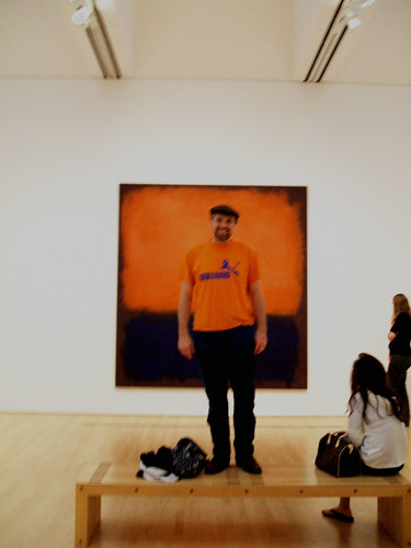
Dutch and I were wandering around the SFMOMA and we found this painting by Rothko. I looked at him, and then I looked at the painting. Was the painting as right at an orange tee shirt with blue jeans? Or was the combination Dutch chose as right as a Rothko?

I saw this particular painting for the first time about five years ago. I had come up with a group of art teachers for a professional development day (one of the huge perks of being an art teacher is that PD days generally involve spending lots of time in a museum). Up until then I hadn't been much of a fan of abstract expressionism. I had seen the famous Pollocks and Rothkos reproduced in books and hadn't been moved by them at all. When I finally saw them in person, I was blown away. Especially by this particular painting. If you stand three feet away and let your eyeballs focus a little beyond the surface of the painting, all of a sudden, you are transported to another world, of a limitless orange sky and a silky blue sea. My memory is so saturated that I associate an orange-laden breeze coming off of it.


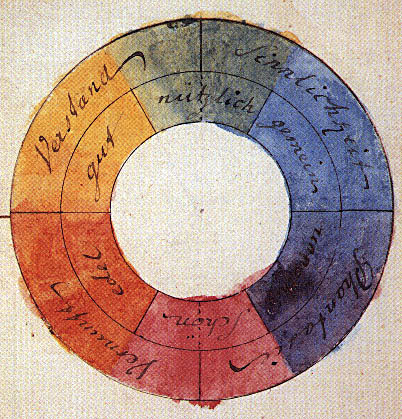
Rothko did not invent the combination of orange and blue. The two colors are on the opposite sides of the color wheel. I found Goethe's example here. I have gone over this with hundreds of students. This combination is called "complementary" and when juxtaposed, they vibrate. Or, in my mother's words, they clash. Maxfield Parrish is another painter who exploits this to wonderful ends. Pictured here is "Cadmus Sowing the Dragon's Teeth."

Orange and blue is one of my favorite complementary pairs. They are opposites of color temperature as well. The orange is hot and the blue is cold. No other combination evokes the "golden hour" sunset light so magically.


Tree at the farmer's market parking lot

This is a picture I took a few years ago with a medium format plastic camera of an actual tree at sunset. Orange and blue is dramatic. The more I think about it, the more I want to start painting again.

Saturday, July 12, 2008

I like my eggplants with basil

::
I spotted this painting last night in the foyer of a local Presbyterian church. We were there to celebrate the Eve of Bastille Day with The Baguette Quartette, and it was a fantastic show, with lots of accordions, banjos and French.
::
Unfortunately, the show started late, so that meant we were staring at this painting for far longer than it deserved. Besides the obvious, we wondered what those purple fruits were. They were the exact color of eggplant, but eggplants are nightshades, and grow from bushes. Trees in churches generally stand for the Tree of Knowledge, but there is no mention in the Bible of Eve eating the Eggplant of Good and Evil (which opens up all sorts of culinary speculation-- for example, how would have she prepared it? I would have taken the Thai route, and sauted it with basil and lemongrass). We wondered about the rope-- we couldn't tell if it was embracing or constraining the blue globe. Or perhaps its the umbilici of two twins. The only place I can think of creation twins is the Popul Vuh. Which opens up even more delicious culinary possibilities, like slathering the eggplant in a fine, dark mole sauce.
::
While medieval Irish-Catholic churches are no strangers to sporting the fuzzy taco over doors and windows, this was neither outside, nor Irish, nor Catholic, nor medieval, nor stone, nor over an opening.
::
Context
::
If I had seen this in someone's garage, or in a house, or even a gallery, I wouldn't have given it a second thought. It would have immediately gone into my kitsch-mother-goddess art mental category and then been forgotten. The objects in churches are chosen with profound care and consideration, as an aid to help focus the worshipper's mind towards something holy. I can't help but think whoever hung it up had that goal in mind, but its cheesiness and its inept production utterly fails to uplift this parishioner's spirit. On the contrary, it sends my imagination down entertaining, but hardly edifying trails.

Sunday, April 13, 2008

Coincidences


Diane Arbus's Twins, originally uploaded by camille94019.

I was on the bus last night and I spotted Diane Arbus's Twins on the arm of a fellow rider. I thought it was funny since I had just blogged about that piece of art. Coincidences like this alwyas make me feel like there is something Mystical Out There, something with a sense of humor, someone who like Diane Arbus.

Busses are great places to people-watch, plus there is a sign on the side of the bus that says that "your image and voice will be recorded" so I don't feel too bad about snapping pictures. The sign doesn't say who is doing the recording.

About ten years ago I had a slight temptation to get a tattoo, but I didn't want it bad enough to actually pay the money and go through the pain. I enjoy speculating about why people get certain images, like what is it about the twin image that compeled that man to put it on his arm? Did it have something to do with the symmetrical and dualistic nature of the twins? Is he a Gemini? Maybe he has a twin, or wants one. Perhaps it resonates with his view of the universe, or maybe they remind him of something. Maybe it was just a dare.

Tuesday, April 8, 2008

Beware, Graphic Content


Georgia's Suggestive Flowers

My latest project for the little munchkins (aged 11-13) caused me a little anxiety. I let them draw names of artists out of a hat and their assignment was to research their artist and create an informational pamphlet. I had fun picking them out. I had to come up with 45 names! Naturally, I chose my favorites first, and then as many of the canon that I could recall off the top of my head. I tried to think of artists who would be mostly appropriate for my students, ones with enough information on them, and ones who were interesting. The art world, like any world, is messy and not always rated G. I was pretty confident that with a little digging, most of the artists produced something that was appropriate for school. I even gave my students a lecture about what to do if they found something disturbing. Oh how I love Junior High.


Diane Arbus's Freaky Twins

A few artists I knew were going to be borderline inappropriate, like Diane Arbus. I was relieved when most of the students got started with very few problems. One boy flagged me down almost immediately. I started to imagine meetings with principals and parents. I was quite relieved to see that he only had a page of Georgia O'Keeffe thumbnails. I asked him what the problem was. He told me he simply couldn't continue and he refused to elaborate. I pressed him, and finally, he whispered to me that he didn't want to look at people's privates. I told him it was just flowers, but he remained unconvinced. I let him do a different artist.


El Greco, rending the very fabric of the spacetime continuum

Another male student found El Greco to be too disturbing. He wasn't able to tell me what the issue was, but he looked genuinely upset, so I told him he could research Charles Schulz instead.

Teaching Moment

Of course, I remembered too late, that there are special safe search engines that are especially maintained for web-searches such as this. I am reminded, in spite of how the research has shown that studying the arts improves reading and math skills, it is constantly on the budgetary chopping block. It simply isn't safe. I am seriously doubting the wisdom of trying to teach the arts in a state-sponsored environment. Maybe I am overreacting. Now that I think of it, teaching isn't safe. Gah! What have I gotten myself into?

Wednesday, July 25, 2007

Priced to Move


Yesterday I gave away all my remaining oil paintings. It sounds terrible, but it actually was a lot of fun. They were done five years ago, in my sad man collage period (not anything that I'd really like to be remembered for). I also gave away the huge nude that hung for a while in the living room until my roomies got tired of her. She is going over someone's fireplace.

The lady who took them exclaimed that they were "way better than than I expected" so good in fact, that instead of painting over them, she was going to "hang them up." I even signed them for her. I got to be an art celebrity for 30 seconds.

I told this story to a few friends. They were all vaguely horrified.

Filthy Lucre Rant

I am going to make a 12 hour attempt to get some dough out of my next out-from-under-the-bed art collection, just so I can say I tried. If no one calls in the next 12 hours, they are going on the free-list (where my real fans lurk) because I cannot move them.

Why Its Easier to Just Give it Away

This kind of "art" is produced by the tons in art schools. For people to part with money, for stuff that essentially has no material value, the artist has to be a big deal. I like it when people are happy and although money is nice, I'd much rather the art go to a good home. It is so depressing when things don't sell, that I'd rather avoid that at all costs (what! I am not a Damien Hirst!!? Will My Ego Ever Recover?). And I hate putting pressure on my friends to buy things (no pressure! no pressure!). This is why real artists have agents to deal with the chores of pricing and bill-collecting. Its not just tedious, its actually painful.

Wednesday, May 16, 2007

Pushing the Envelope of Good Taste

I was unemployed today. The substitute service didn't call. This is my excuse for the following post(cards).

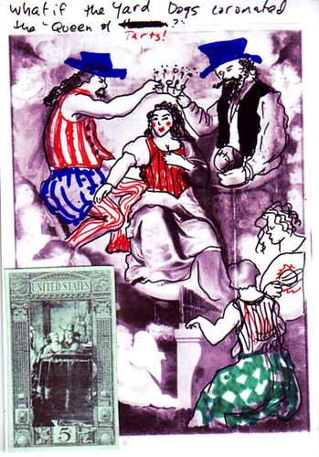
Queen of Tarts

Queen of Tarts
for the H

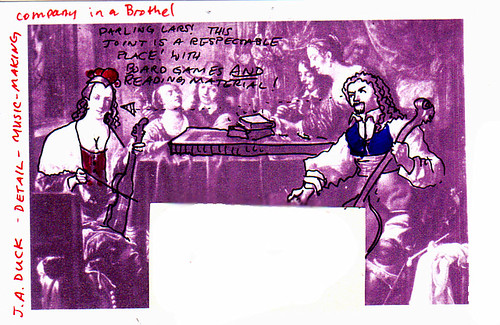
A few days ago, I scanned in some of the art file cards and tried my hand at photoshop-prepared collage components. Not only did it take forever, but I wasn't particularly thrilled with the results. I was seduced with having the power, as it were, to create my perfect bits. I forgot that collage is magical just because the ol' ego is out of control, giving the subconscious, um, something to work with (I cringe when I have to resort to bad psycho-babble). The deliberateness required to manipulate photoshop short-circuited my usual grab-and-paste method. I made a bunch of plain postcards of just the images of JA Duck's "Music Making Company in a Brothel" and Aernout Vinckenborch's "Coronation of the Virgin with Music Makers" (in Atwerp's St Paulus Church) I also took my favorite details and created whole page of postage stamps. Unfortunately, I printed those out on glossy photo paper, so they look fake.

From Heaven to Earth with a few Sharpie Lines

The more I looked at this painting, the weirder it became. Between all the little floating heads (attached to ?), the odd expressions and the nearly possessed nature of the draperies, the elements, taken by themselves are surreal. Additionally, Vinckenborch's anatomy is particularly ridiculous, he ought to take a class in human anatomy with me (what happened to Jesus's latissimus dorsi? and that organist's obnoxious biceps!). What is Mary's hand doing on Jesus's knee? I started by adding lips (because of the printer, her's were nearly washed out), then it all went down the slippery slope to perdition from there. With big red lips, the trio no longer looked appropriately family-like, so the men got big hats and vests, the lady got a bustier and the mood became burlesque-ish.

nb I couldn't find anything in the wiki, or google for either Duck or Vinckenborch. Either I misread the information, or this is a gap in the internet.

to hm-obverse
also for the H

A Vinckenborch-inspired drawing and postage "stamp." I do admire his grasp of foldology. Gone are the days when an artist's ability to render fabric carried his career, although, it may have been a curse, as well.

The Fine Line Between Heaven and Bawd


Music making company in a brothel
for the H

This painting seems mis-titled. I don't know what 17th century Dutch brothels were like, either (I am guessing, because the card included neither a date, nor a country, tho' at the time of printing, it was at the "Netherl.Art Institute"). The activities portrayed look like they could easily happen in a modern coffee shop, with live music, books laying around, and board games. The only suggestive thing is the bed in the background (its clearer in the original, I cropped this version). I wonder if this was supposed to be a self-righteous statement about the wages of bad behavior, or a strange, socially-appropriate portrayal of naughtiness, or perhaps it was both.

I am more scandalized by the bad draftsmanship and questionable dogma of the "Coronation" than the genteel bedroom partiers. My non-marianist theology doesn't have room for a Queen of Heaven, but it has plenty of space for music and fun.

And for something Thoroughly Modern and American
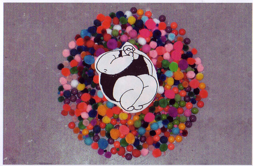
Fat Camille Lazy Girl Postcard
for the KB

I found this art card at a local art school and I thought it could be improved with a Fat Camille sticker. This is an example of why I really love art that has narrative in it. What can I say about pompoms and jelly beans? It certainly has no naughty-potential.

Friday, May 11, 2007

Postal Dividends


The mail contained an unexpected treasure this afternoon.

From the H

Dead Cat

This work does not come out of the proverbial void, it is part of the H's ongoing visual quest. The tag on her blog, "There aren't enough plastic bags to fill it all" provides the first clue.

Plastic Bags

In this disposable culture, plastic bags are a ubiquitous by-product of commerce. They are used once, and then destined for the land-fill. Sadly, many bags don't make it that far and they litter our lives. Many would consider this a tragedy, but not the H. A bag holds (ha ha) promise, it symbolizes "containment" and it also can be used to stow one's bottle-cap collection any other detritus one runs across in one's daily travels, or whatever "it" is.

Beer Bottle


"bottle caps" image copyright Heather Morgan

If one looks for garbage, one won't ever be disappointed. I am not going to say that the artist "finds beauty in that which is overlooked" because that is cliche. The H might find (and this is wild wild guessing on the part of the writer) a world hidden in a bottle cap. Or perhaps she finds getting lost in the hills, valleys and the labyrinthine wrinkles therapeutic. Maybe the rust spots look like a secret map. Nothing is below or beneath her notice. The insignificant can be mined for a surprising commentary.

The Story

H went to art school shortly after high school. She left her smallish town and plunged into heart of Los Angeles. She was there, circa 1993, and the postcard depicts the view from her window. It looks like a crime scene, with the phrase "dead cat" as one of the first things the viewer sees. With her loving attention, this scene of a typical, seedy alley turns into something strangely clinical and macabre.

Mixcoatl

In place of the traditional stamp, the H has placed a small, Sharpie-enhanced, cut-out of Mixcoatl (pronounced mish KO tl). A stamp shows that a fee has been paid, so that the domestic postal service will carry the parcel to the recipient. Stamps are decorative and functional, and they play symbolic homage to the country they are from. According to my internet source, he is the Aztec god of the hunt, and like Prometheus, brought fire to humanity. Los Angeles has deep, historic connections to Mexico, where Mixcoatl hales. His Aztec celebrations included roasted game and human sacrifice.

Pizza Velez

On the right side, H points out a discarded pizza box, with the label "Pizza Velez." "Velez" sounds like it could be a Mexican name. Pizza is classic American food, but if it had to have a nationality associated with it, it would be Italian. Many pizza places have neutral names, like Round Table or Straw Hat, but they often have italianish names, like Luigi's or Tony's. Velez didn't take that route, and H is pointing out the rich cultural recombination that is happening around her.

There will be more postcards to come...

I sure hope so.

Related Links

Rosa's Thoughts On Garbage

Blog Archive

Readers